
Splenda | Packaging Design & Innovation
2024
Designed by Maria Pellegrino as a Graphic Design Intern at Splenda, Heartland Food Products
Objective:
The objective of the various exploratory design projects on this page was to develop new, innovative packaging solutions - including both form and design - that resonate with a modern, younger consumer base while addressing specific "Jobs to Be Done" identified by the marketing team. The goal was to position Splenda as a contemporary lifestyle brand that not only fits into the daily routines of a health-conscious audience but also enhances them—whether at home, on the go, or in social settings.
Target Audience:
The primary audience for this project includes individuals between the ages of 18 and 35 who appreciate convenience, visual appeal, and ethical consumption, often seeking products that are both functional and aesthetic.
Design Process:
The design process began with in-depth research facilitated by the marketing team to understand consumer habits and preferences around sugar substitute packaging. From these insights, I used this to pinpoint key design opportunities, and moved into ideation with a range of concepts. Each design concept is unique to the point(s) they aim to address. Overall, this project aims to explore how form, design, and function can come together to transform packaging in a way that meaningfully aligns with the needs and preferences of the new, younger target audience.
‘Away From Home’ Splenda Granulated Packet
For this project, I was tasked with modernizing the existing design—originally featuring an American flag through the logo—while maintaining its "Made in the USA" message and broadening its appeal. My solutions used bold red, white, and blue stars to subtly yet clearly convey patriotism, while keeping the Splenda logo in a flat navy blue for improved legibility and stronger brand consistency.
One of my designs was ultimately selected for nationwide distribution from among several competing concepts. 50 million packets are produced on a daily basis.


*The design above for the Splenda AFH packet was ultimately selected for nationwide distribution.

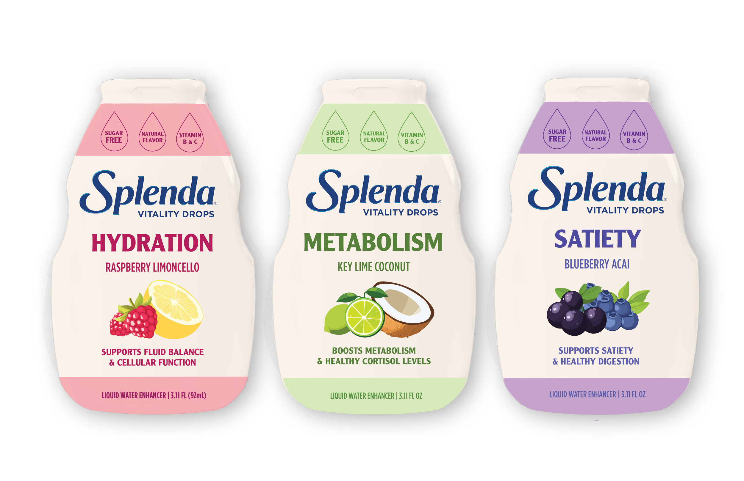
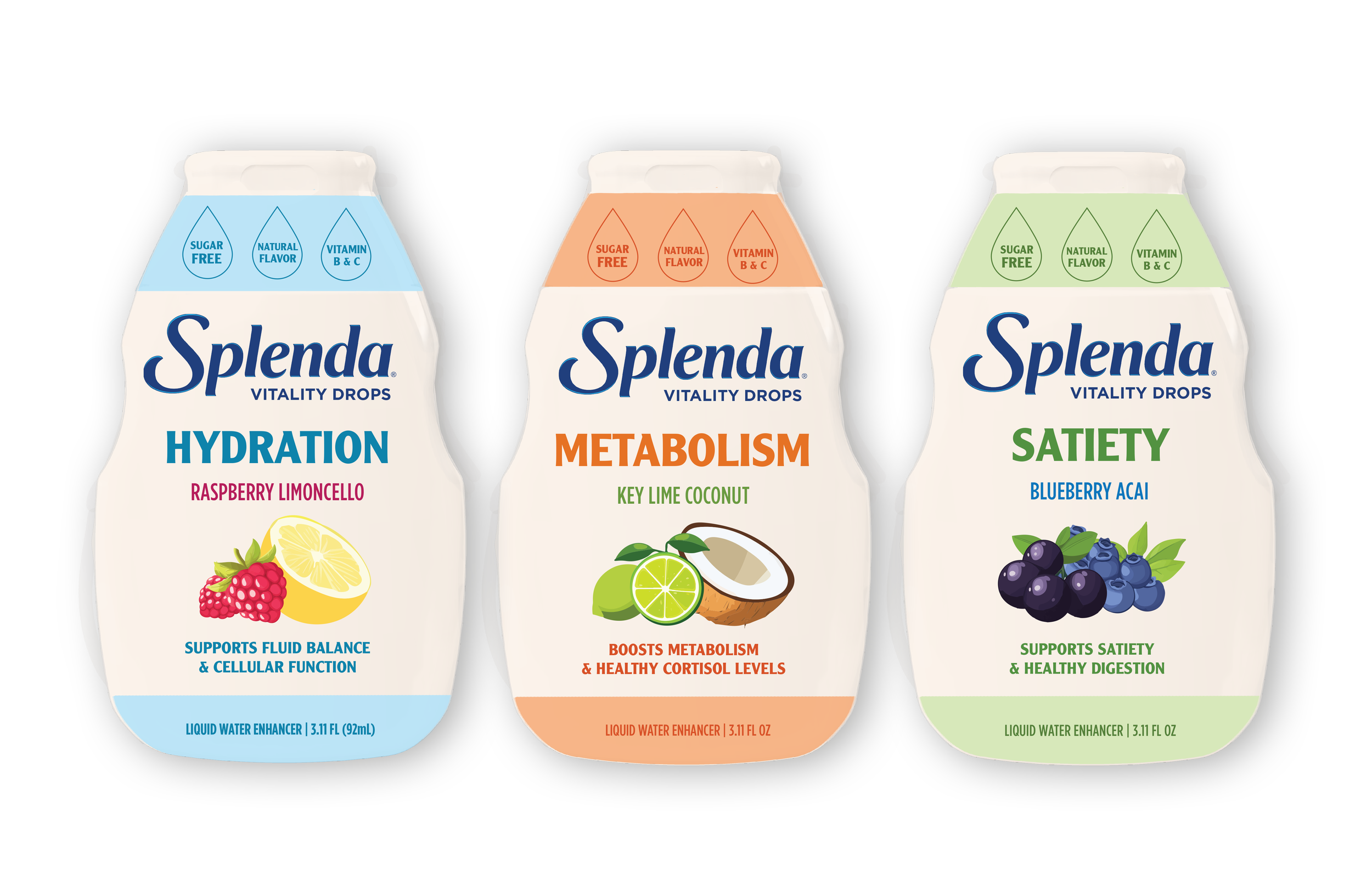
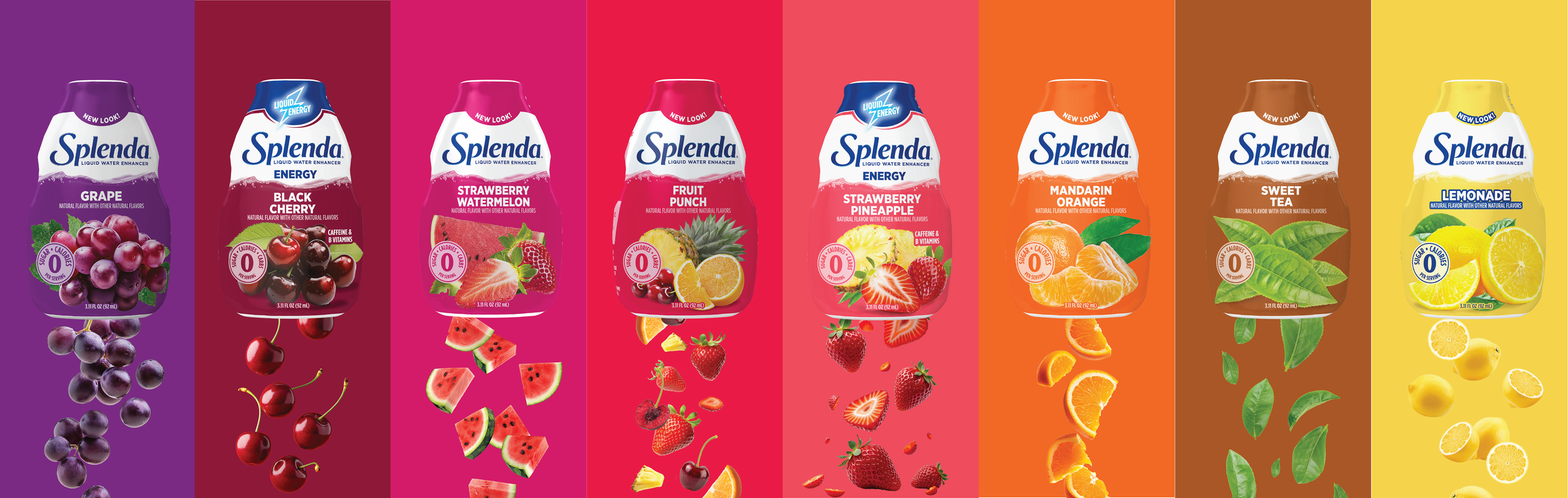
Premium Line Liquid Water Enhancers
Tasked with shifting Splenda’s liquid water enhancers toward a more premium positioning, I designed a solution that uses muted colors, soft pastels, and bold iconography to convey a sense of elevated wellness. Visual elements like water droplets and the name Splenda Vitality Drops reinforce functional benefits such as hydration, metabolism, and satiety. By prioritizing clear callouts to these benefits, the packaging communicates a more intentional, health-driven purpose beyond just flavor.
These tested very well among females from 18-35 years old across two weeks of consumer testing where interviewers inquired about relevance, benefit, and taste.
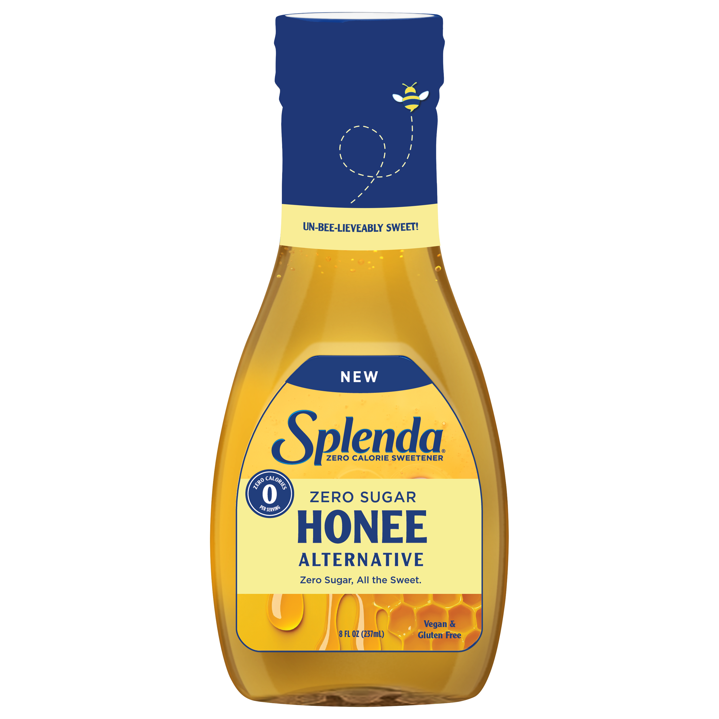
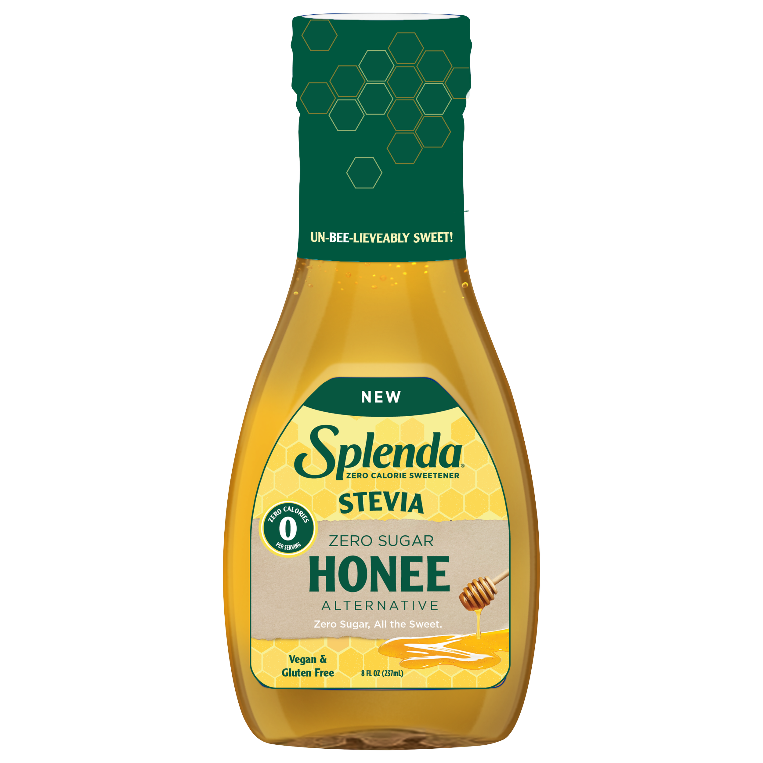
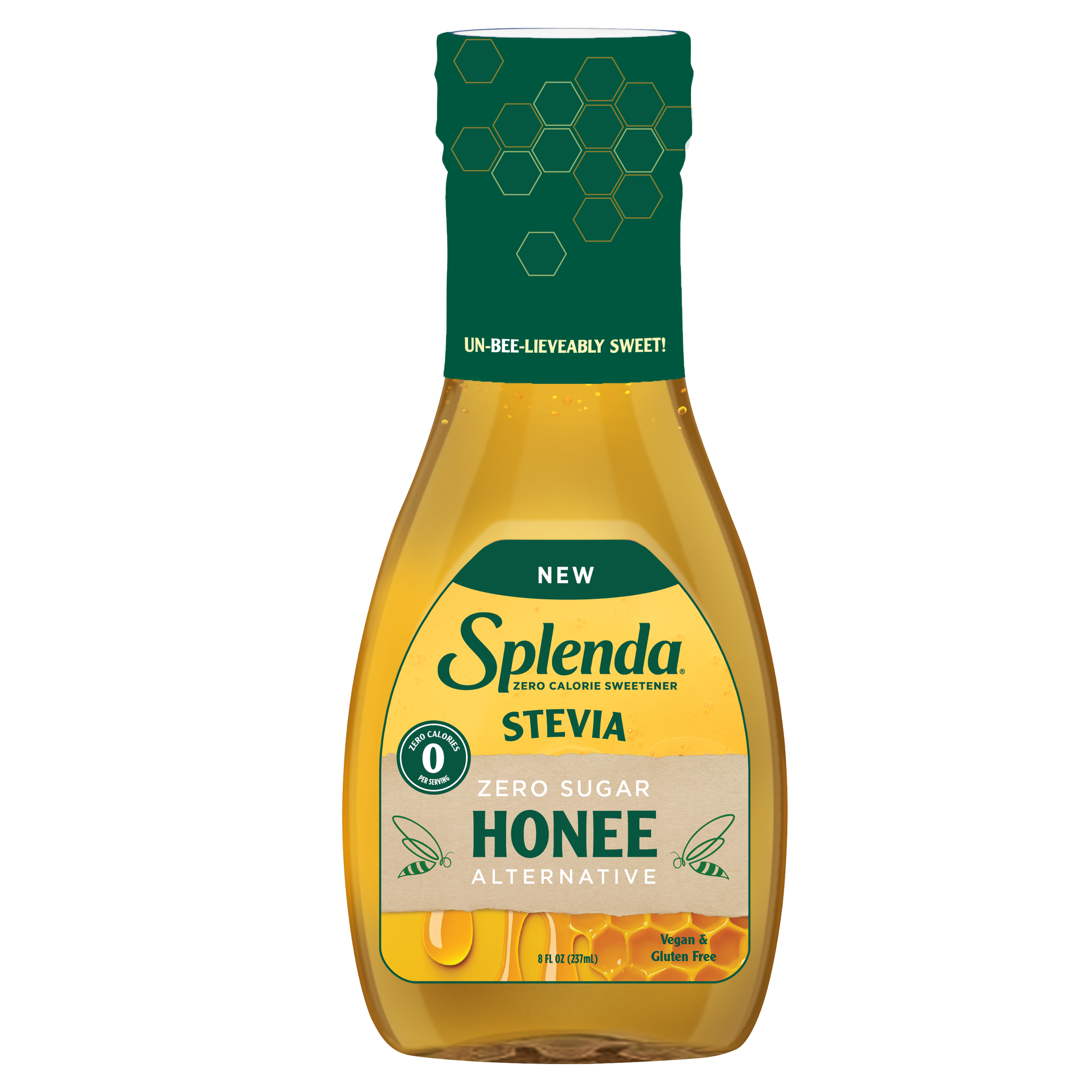
“Honey Alternative” Design Solution
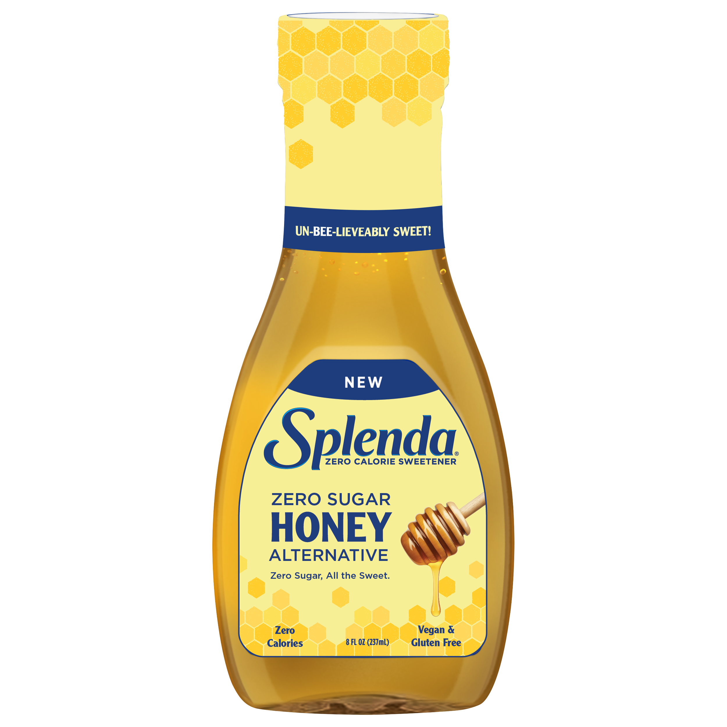
This design was put into consumer testing after it was presented to the Sr. Director of Brand Marketing, and subsequently tested as the best overall solution, based on results across the categories listed below in consumer testing.
GROUP: Under 35
HIGHEST % IN CATEGORIES:
Purchase Intent, Quality, Healthy, Clear What to Expect
GROUP: 18 - 65
HIGHEST % IN CATEGORIES:
Purchase Intent, Healthy, Clear What to Expect
GROUP: LCS Buyer
HIGHEST % IN CATEGORIES:
Purchase Intent, Healthy, Relevant to Consumer
Design Iteration #1
Design Iteration #2
Design Iteration #3
Design Iteration #4
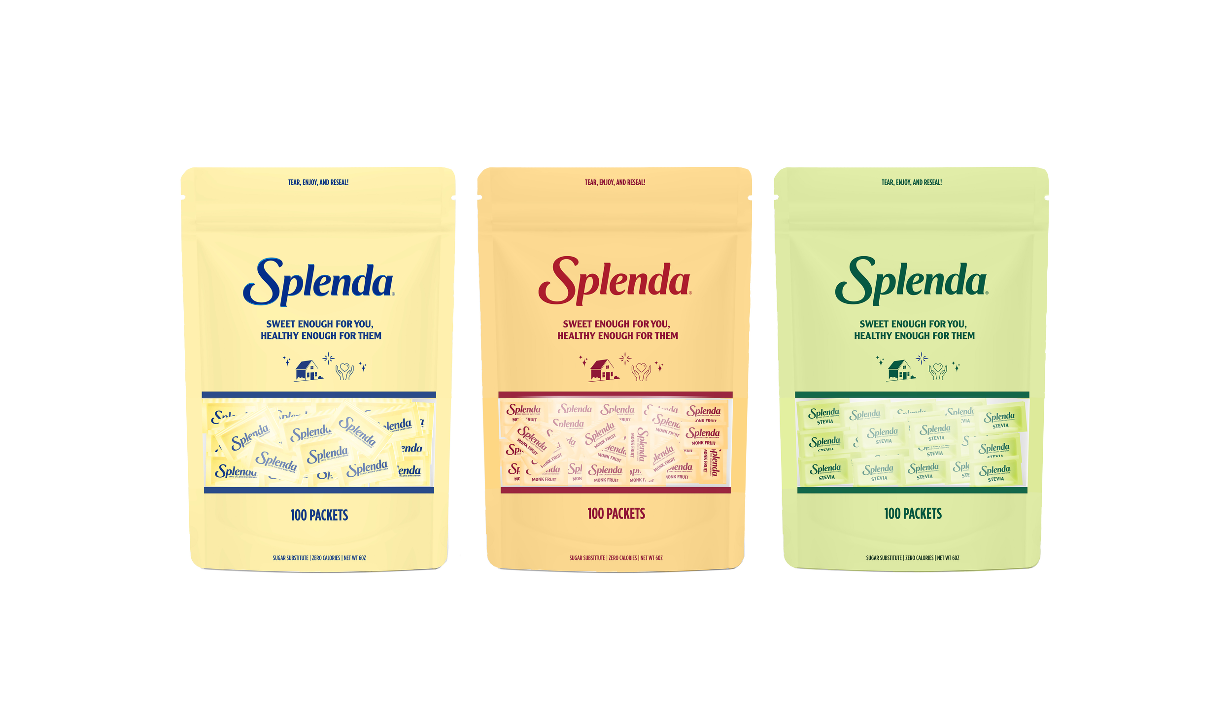
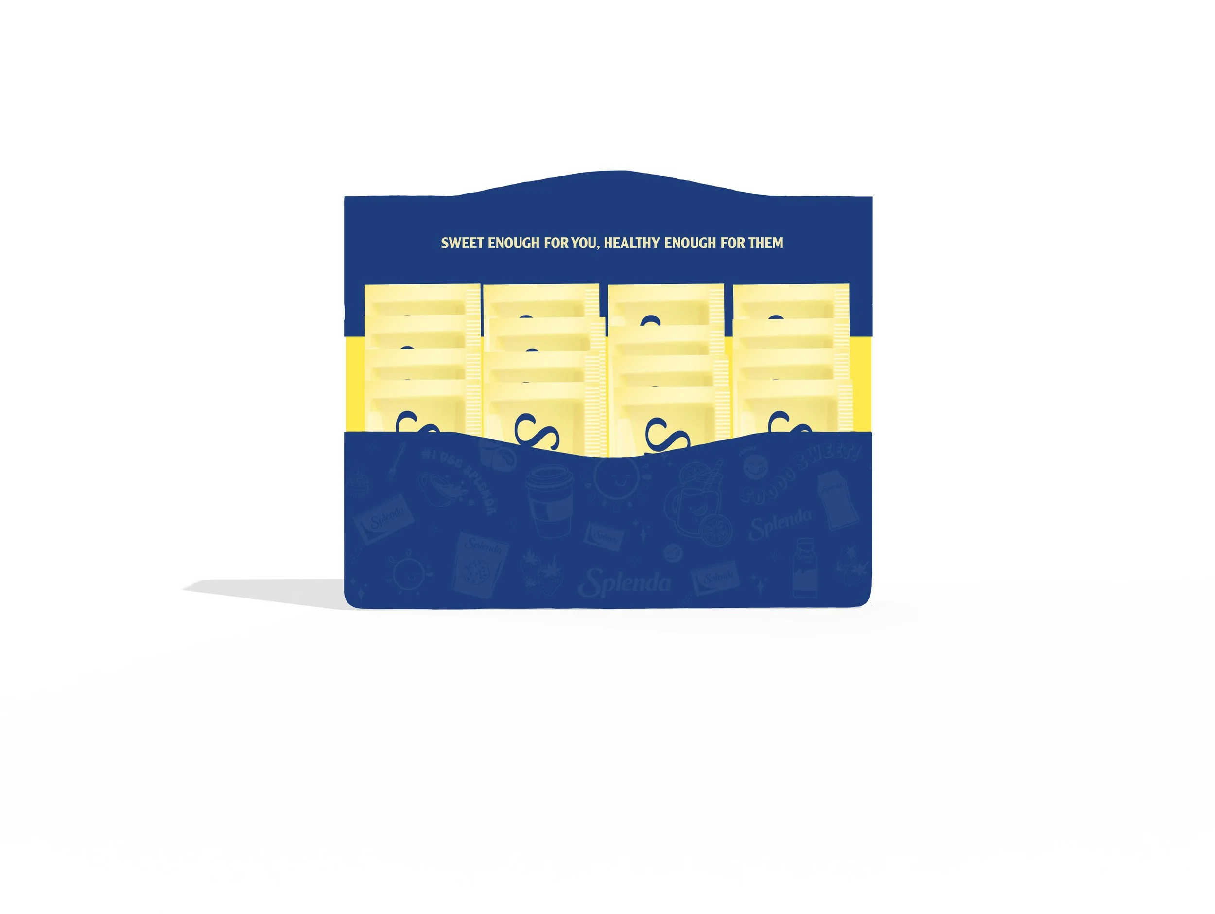
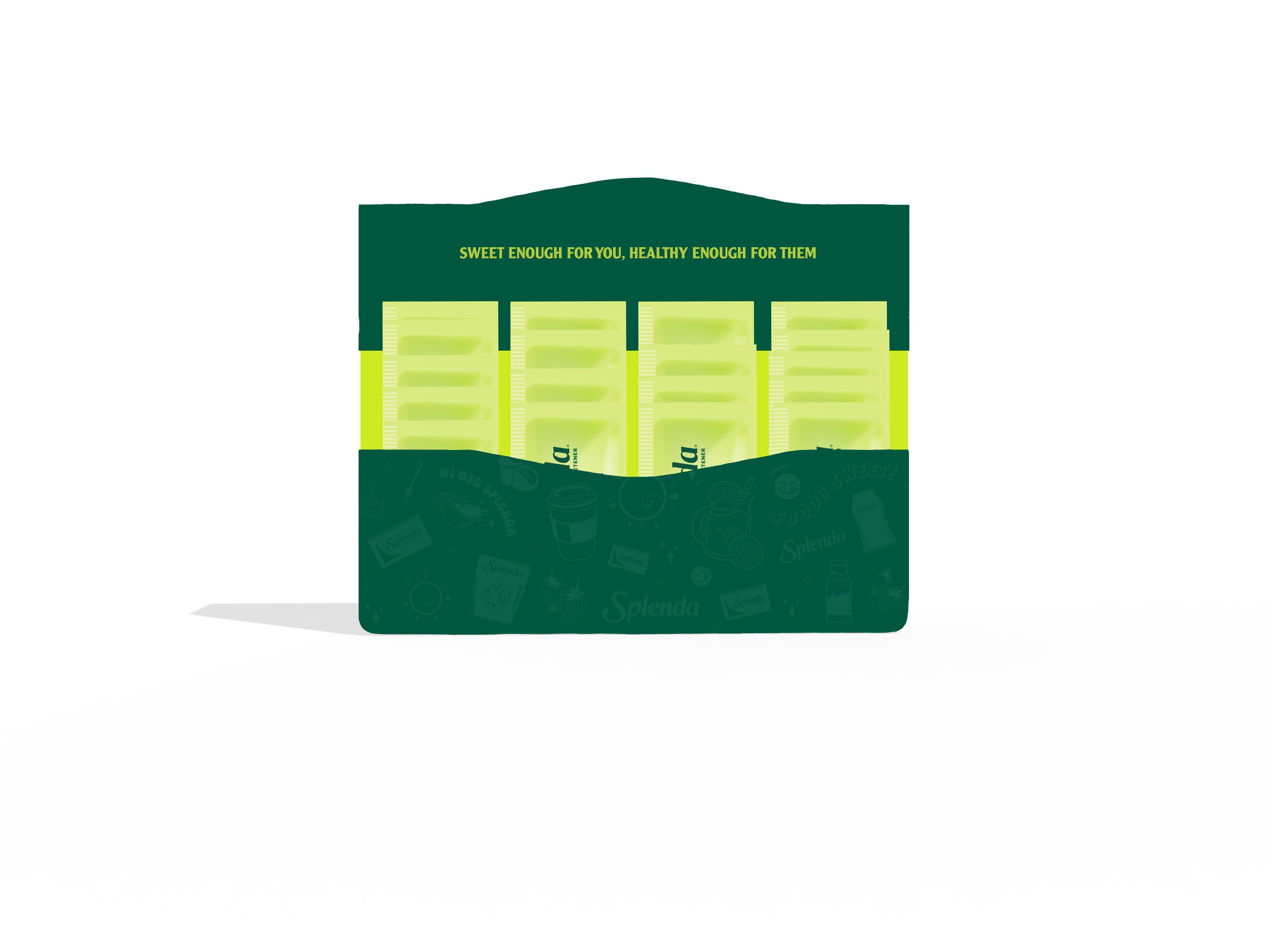
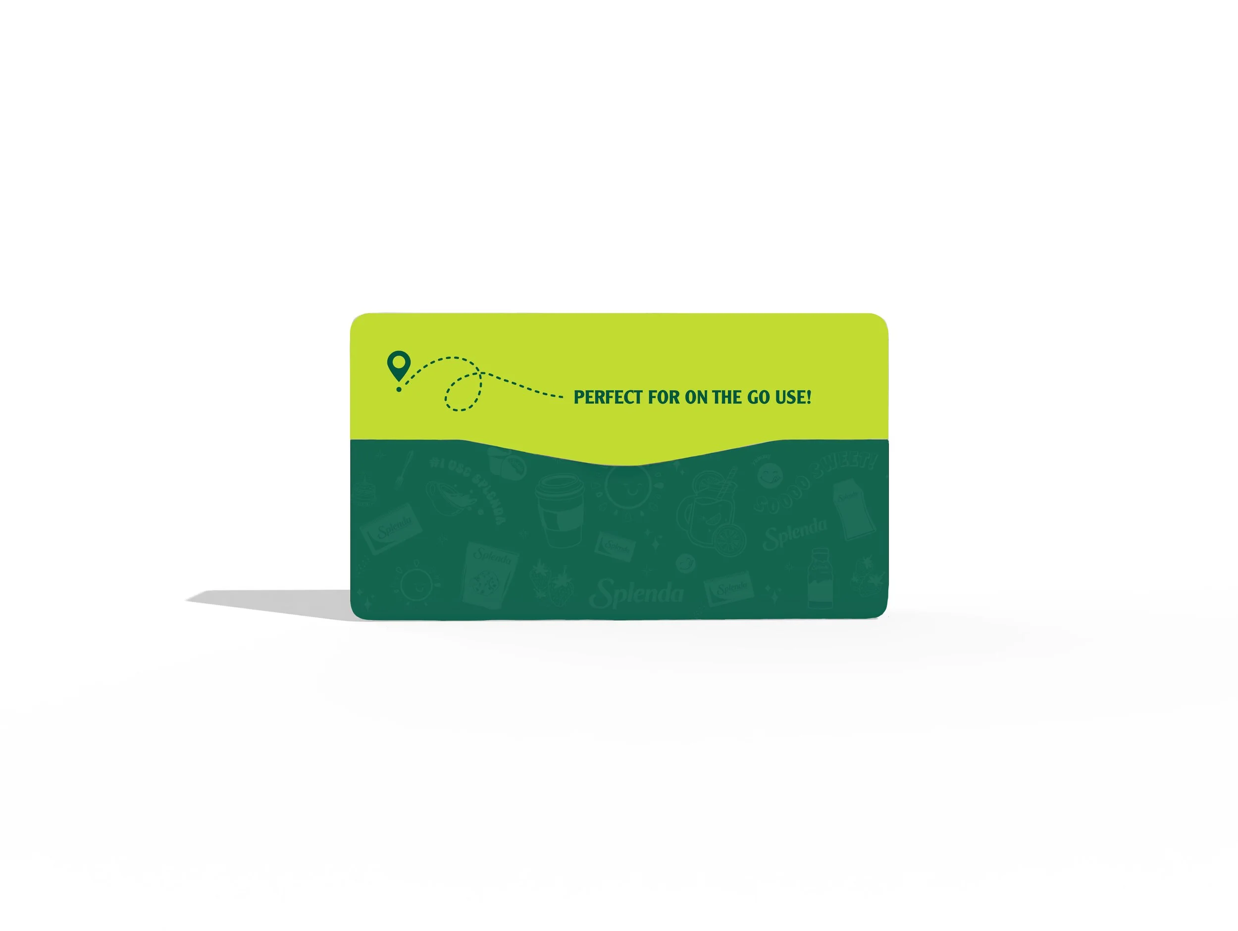
“On the Go” Splenda Granulated Packet - Solution 1
This design solution reimagines Splenda packaging as a resealable, “trail mix-style” pouch for convenient on-the-go use, made from flexible, portable materials. Bold, vibrant colors and simple, confident messaging—like “Sweet Enough for You, Healthy Enough for Them”—reinforce the brand’s modern, health-conscious appeal and emotional connection.
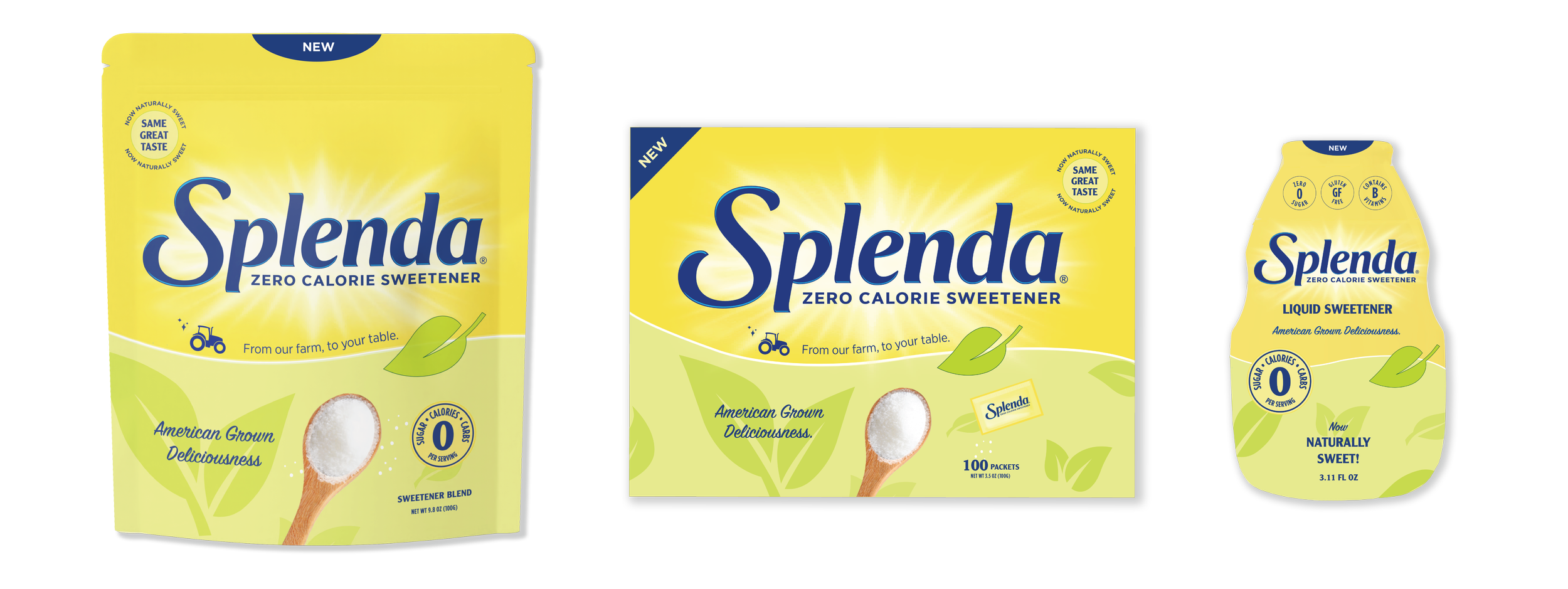
Splenda “From Our Farm to Your Table”
For this packaging design, I was tasked with maintaining the brand’s iconic yellow and blue while shifting toward a more natural, farm-to-table look. I achieved this by combining bold illustrations—such as a tractor and falling leaves—with photography of a spoonful of sugar to emphasize both the product and its natural origins. This consistent visual approach was applied across multiple SKUs, blending illustration and photography to create a cohesive, approachable design.
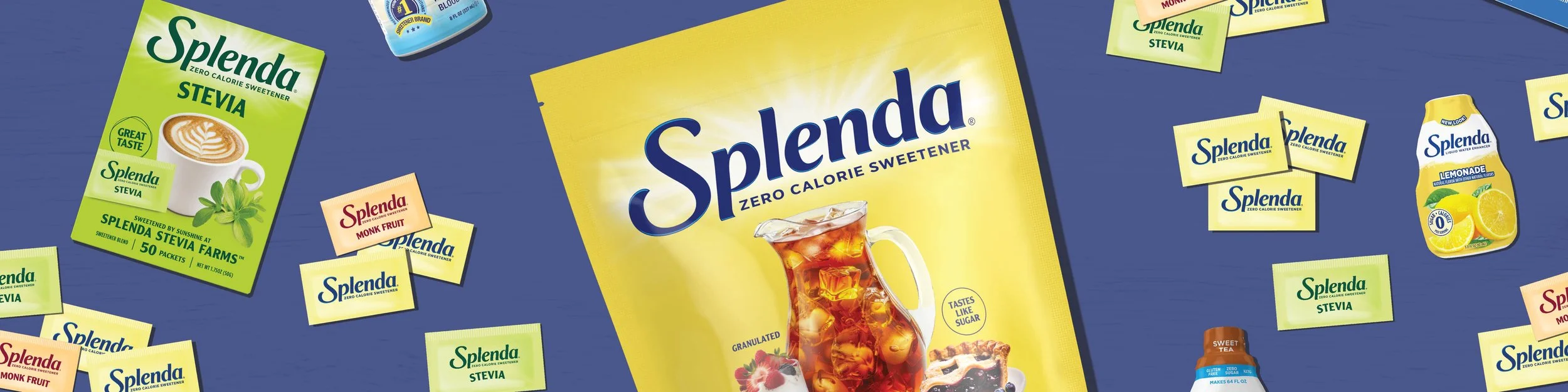
LinkedIn - Company Banners
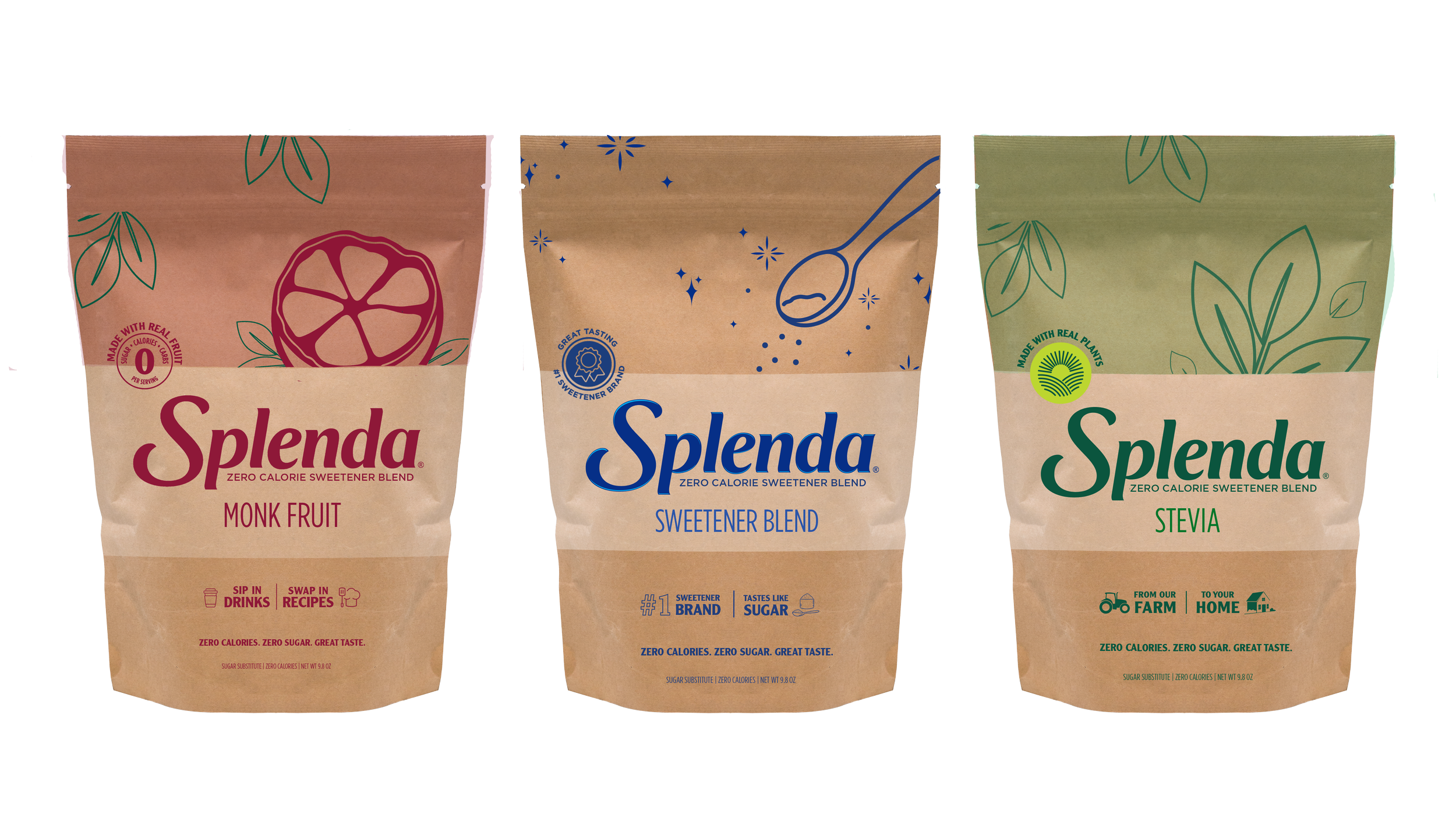
Splenda Granulated Bulk (Pouch, LWE) - Craft Paper Concept
This packaging design targets a younger demographic through bold colors, minimalist iconography, and a natural aesthetic. The use of kraft paper emphasizes sustainability and reinforces Splenda’s all-natural sugar positioning - a focal point of this project.
Pouch Design Solution
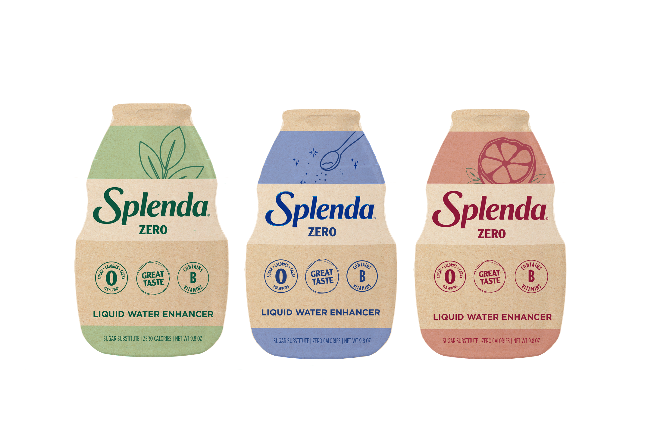
Liquid Water Enhancer "Zero" Design Solution
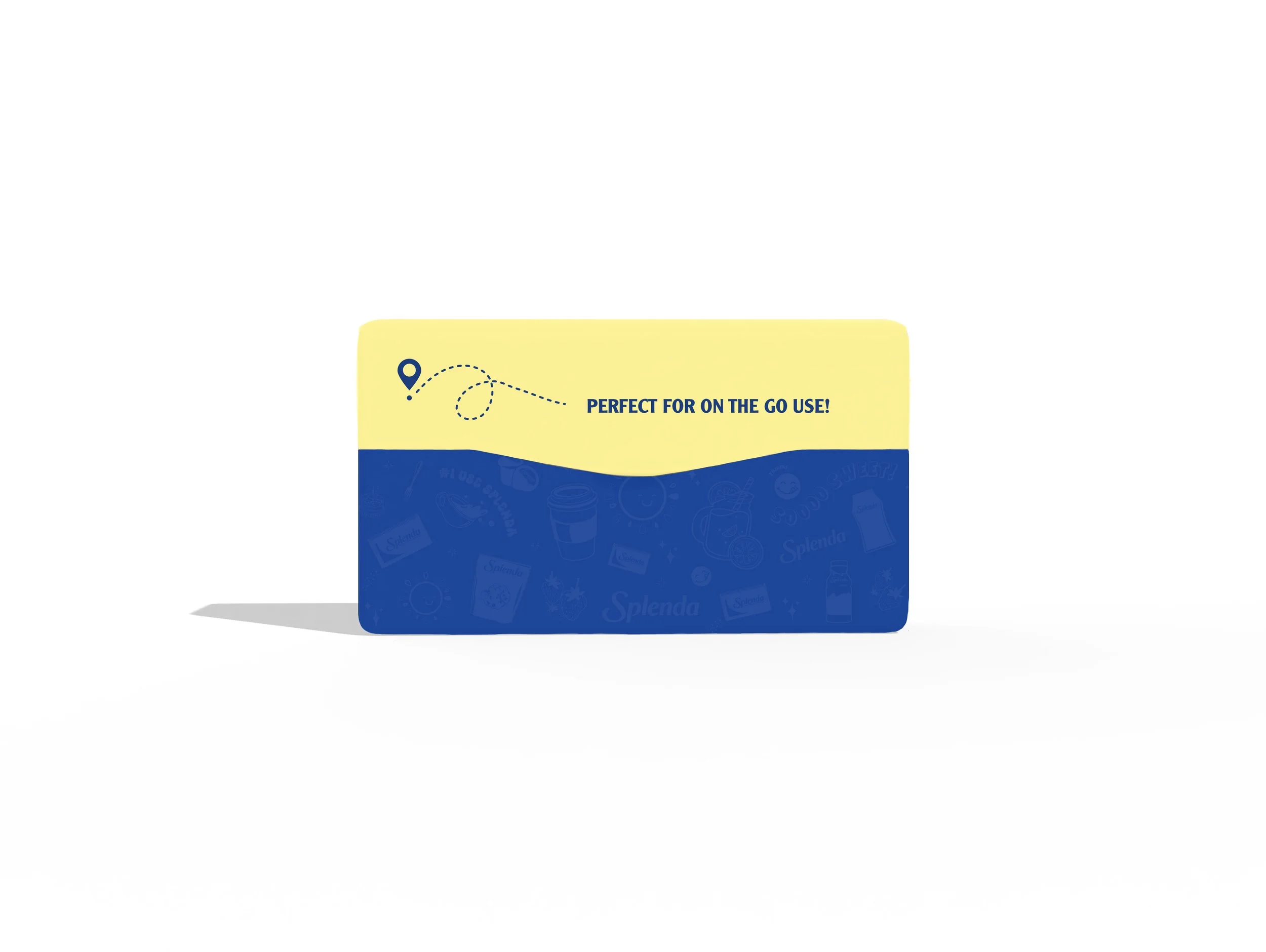
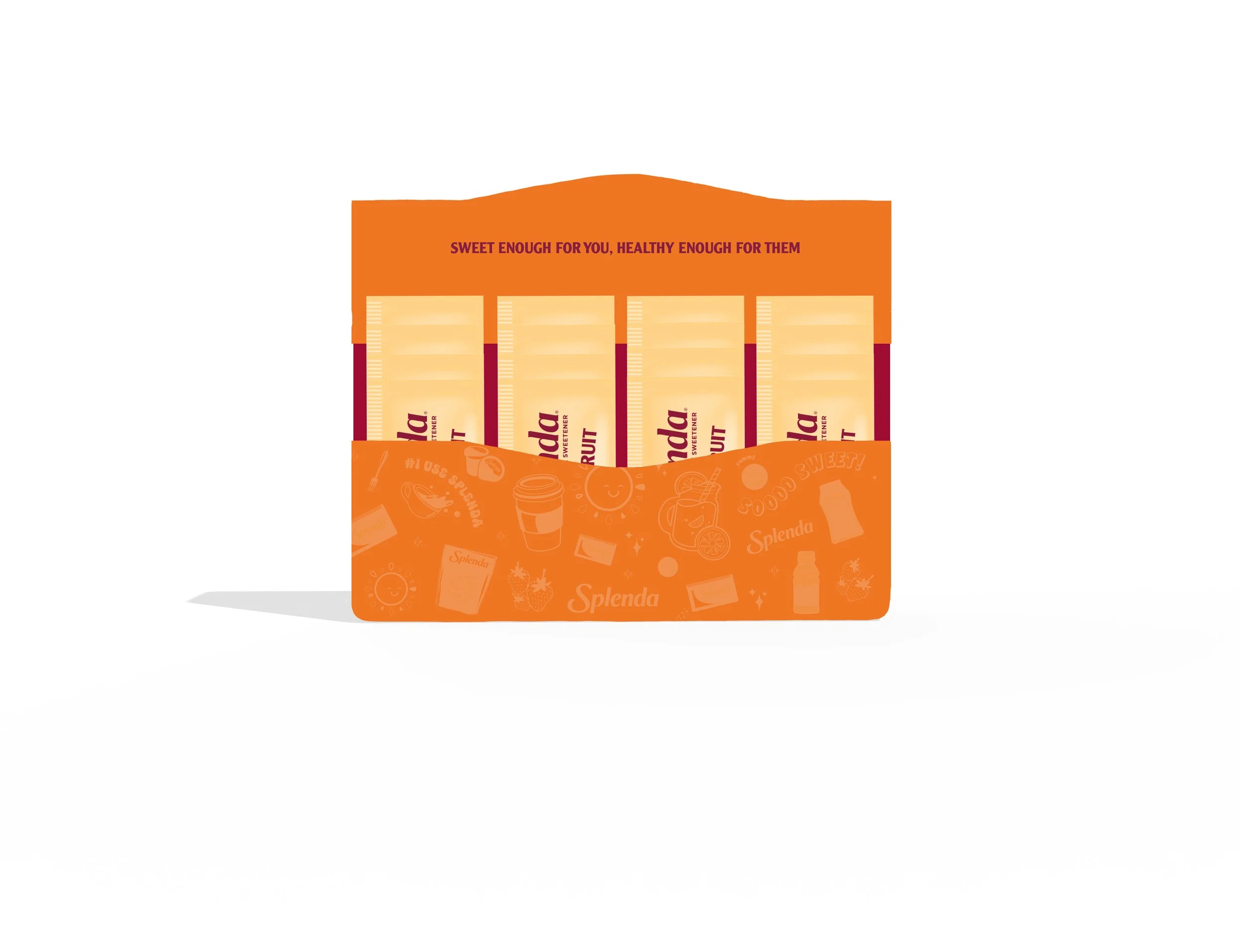
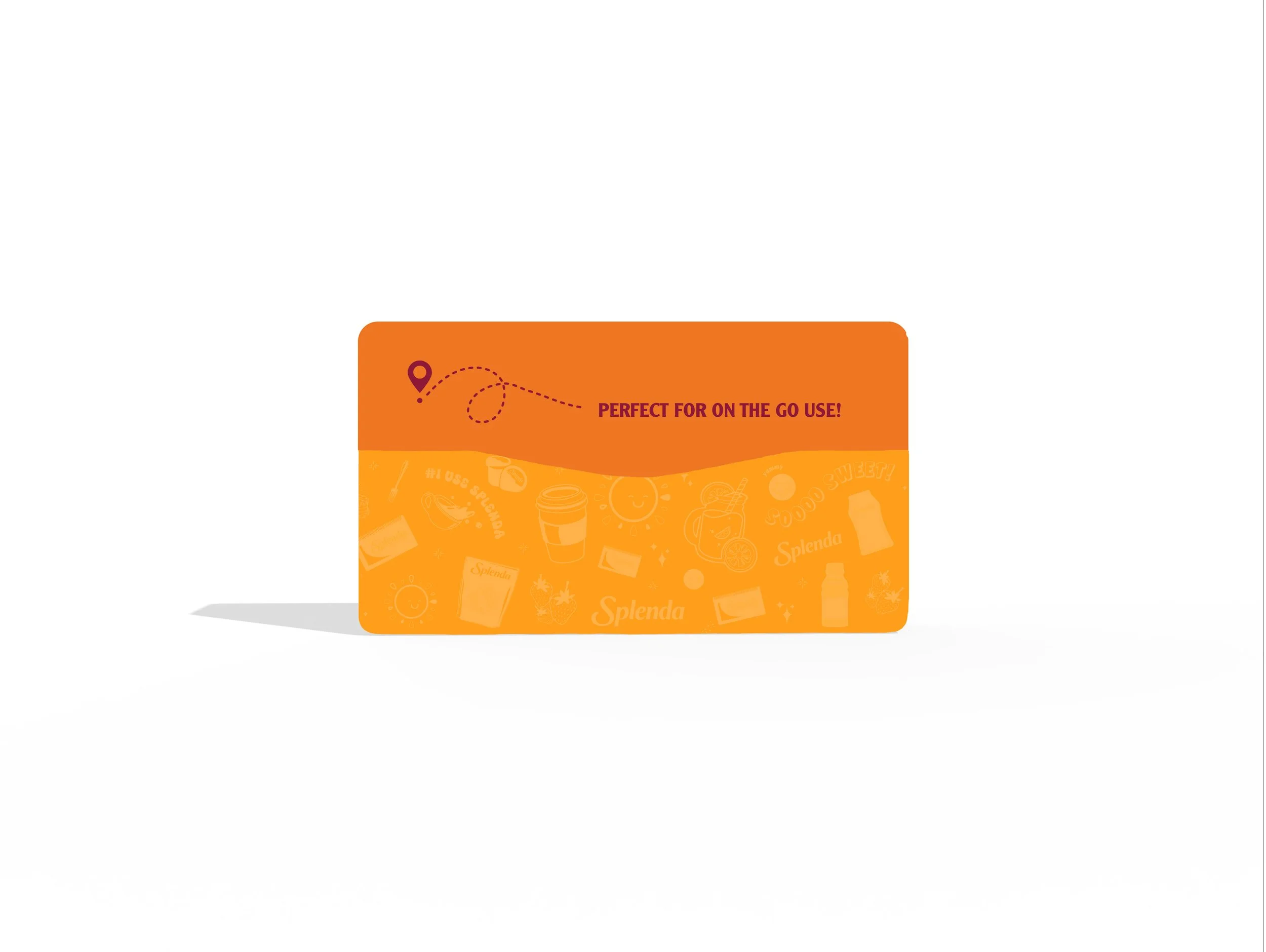
“On the Go” Splenda Granulated Packet - Solution 2
This design solution draws inspiration from a familiar gum-style container for convenient, on-the-go use, using either a plastic closure or small folding carton. Bright, vibrant colors, playful illustrations, and bold messaging—like “Sweet Enough for You, Healthy Enough for Them”—highlight the product’s portability and health-conscious appeal while reinforcing its packet-based format.
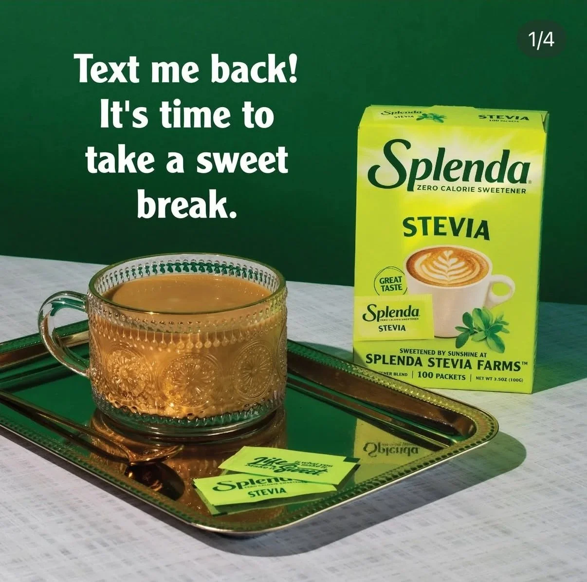
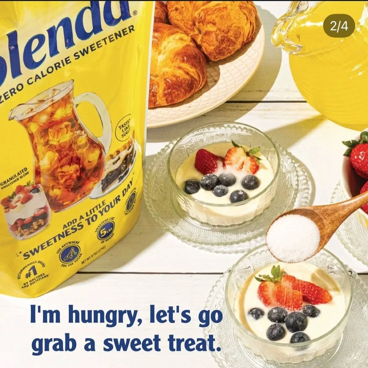
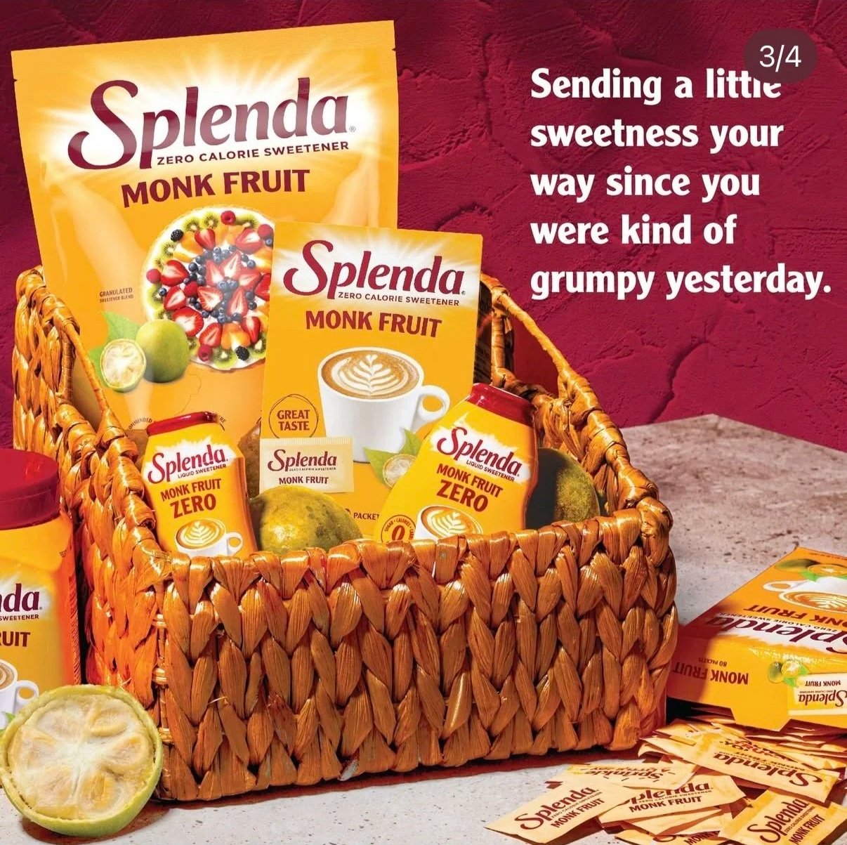
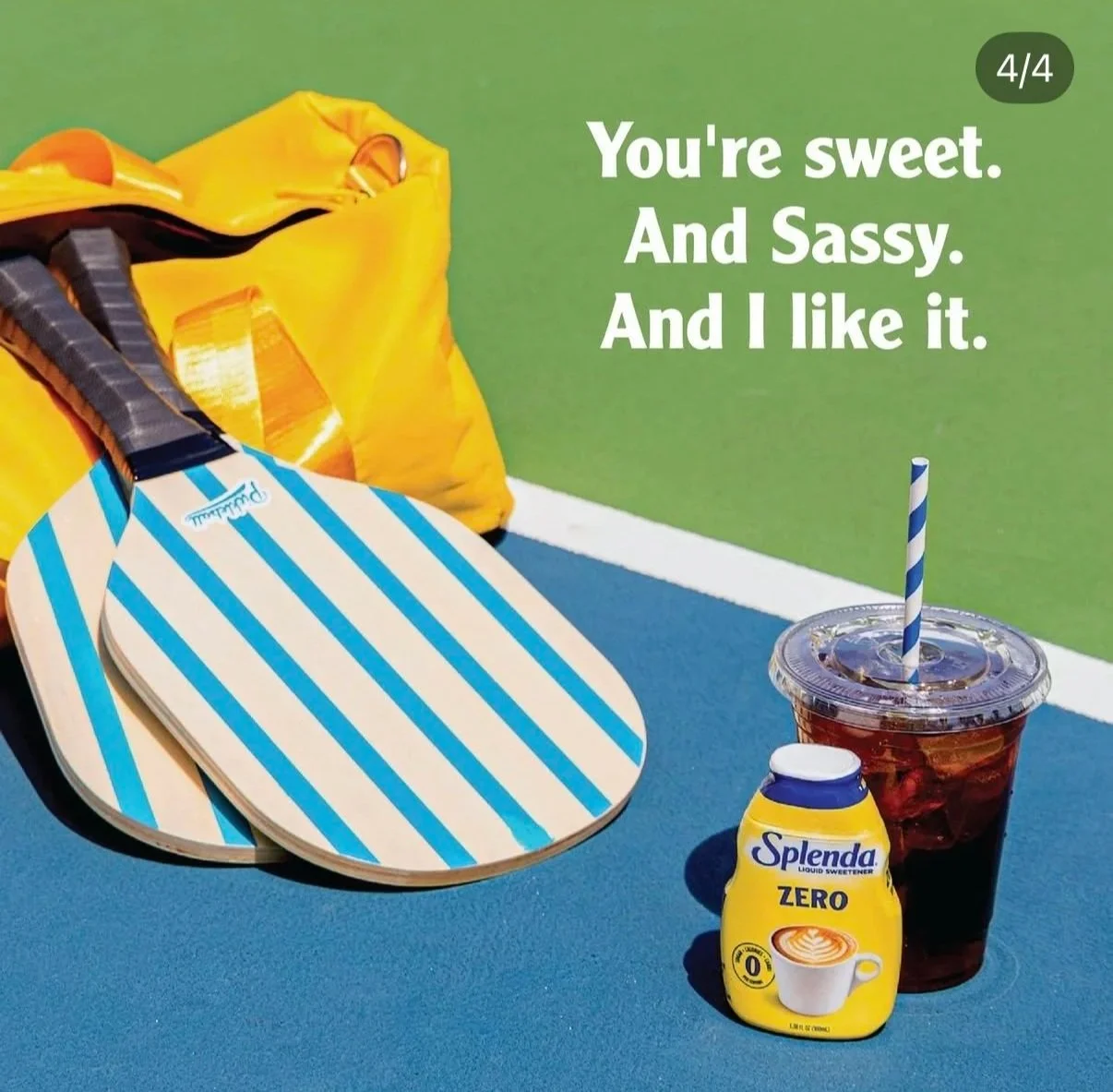
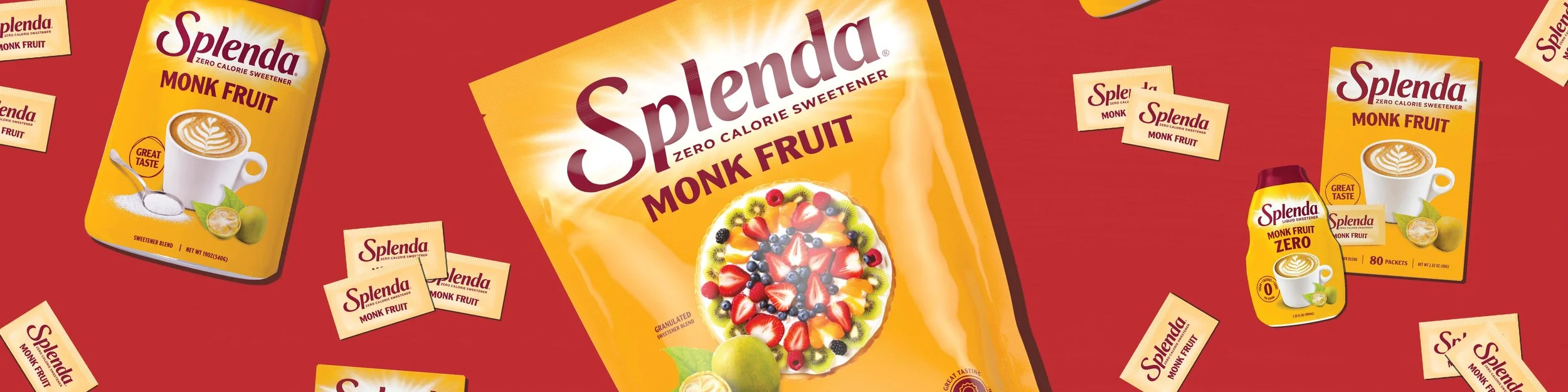
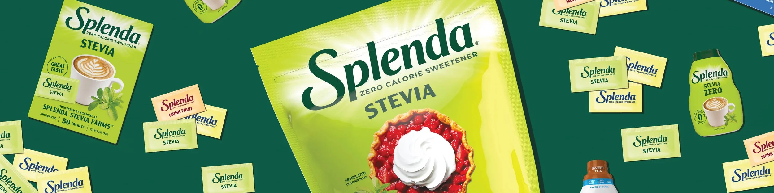
Instagram - Samples